 Series 1
Polling
Workshop: September 24 from 10am-5pm
Panel: October 5
Workshop: Saturday, September 24 from 10am-5pm
with Harry Enten & Neil Paine, FiveThirtyEight
The first workshop in the Transparency Series takes you through techniques for looking at one or more polls over time. Your instructor is Harry Enten, a senior political analyst at FiveThirtyEight. He will be assisted by his colleague Neil Paine, another talented data journalist and sportswriter. The day-long workshop will present tools and strategies for working with polls — starting at the very beginning with simple random samples, and leading to the detailed models that are employed today. All the while, we will emphasize how to find and tell interesting, novel stories with polls. No prior experience in statistics or data analysis is needed.
Bios: Harry Enten is a senior political analyst and writer for FiveThirtyEight, a data journalism website. He studies polling and demographic trends to try and tell readers who and why candidates and parties win and lose elections. Previously, he was a writer with The Guardian in New York. Harry graduated from Dartmouth College. At Dartmouth, he started his own blog Margin of Error, where he blogged about political statistics. Neil Paine is a senior sportswriter at FiveThirtyEight, with writing on all of the major American sports. Before joining FiveThirtyEight, Neil was a Basketball Analytics Consultant for the Atlanta Hawks and also worked for Sports Reference LLC. Neil is a graduate of Georgia Tech.
Panel: Wednesday, October 5
co-organized and hosted by Thomson Reuters
Join us in at Reuters for a discussion on polling and its importance in the presidential race. As the 2016 election nears, we pore over opinion polls looking for subtle (or not so subtle) clues about how things will fare on November 8. We say Clinton is ahead because most of the polls have her ahead, yet there are polls that have Trump ahead. Which polls are right? Or reliable? To journalists, of course, the polls themselves aren't the story, they help tell us a story. The narrative power of polls extends far beyond a single number on a given day. Taken collectively and in combination with other data, we can tell deep stories about the nature of our public’s opinions.
 Series 2
Mapping & Cartography
Talk: October 14 at 5pm
Workshop: October 15 from 10am-5pm
Talk: Friday, October 14 at 5pm
The world has always been a connected system, and it's only becoming more so. As a form of journalism, maps contextualize the world by visually linking events to each other and to their geographic surroundings. Join the Brown Institute as we welcome Al Shaw, developer at ProPublica and Michal Migurski, VP of Product at Mapzen to talk about mapping in the context of journalism.
Al Shaw is a developer at ProPublica's News Applications desk. He has published numerous visualizations and analyses on disaster mapping. His latest interactive story "Hell and High Water" includes a map with seven animated simulations depicting a large hurricane hitting the Houston-Galveston region. He's also released open source tools to make it easier for newsrooms to produce maps quickly. From 2008 to November 2010, Al was Designer/Developer at Talking Points Memo, where he redesigned the homepage and news blogs, and created the first version of TPM PollTracker. He attended the University of Chicago, where he studied modern Middle Eastern language and culture.
Michal Migurski is currently the Vice President of Product for Mapzen, an open and accessible mapping platform. Migurski is also the CTO for Code for America, a Bay Area non-profit organization helping make government digital services "beautiful, simple, and easy to use." Previously, Migurski spent nine years as a partner and technology director at the celebrated San Francisco design studio Stamen. At Stamen, he oversaw inventive and powerful mapping and data visualization projects, focusing on ways to encourage the public to participate in collecting and representing data. Migurski holds a degree in Cognitive Science from UC Berkeley.
Workshop: Saturday, October 15 from 10am-5pm
with Derek Watkins, New York Times
If your story prompts questions like "What caused this to happen where it did?" or "Does this happen the same way in other places?", a map can probably help illuminate things for your readers. Once the exclusive domain of specialized practitioners, new tools make it easier and easier to analyze spatial data and publish maps online. Derek Watkins, a Graphics Editor at The New York Times, will give a day-long crash course in dealing with geographic data, designing elegant maps, and putting them on the internet. The overarching goal will be learning practical ways that maps can be used as a tool for journalists to tell more compelling stories.
Derek Watkins is a Graphics Editor at The New York Times, where he works as a designer, developer, reporter and geographer to visually present the news. Projects he's been involved with there have been recognized by the Society for News Design, Malofiej, the Ellies and the Emmys. He holds a Master's in Geography from the University of Oregon.
 Series 3
Virtual Reality
Talk: November 18 at 5pm
Workshop: November 19 from 10am-5pm

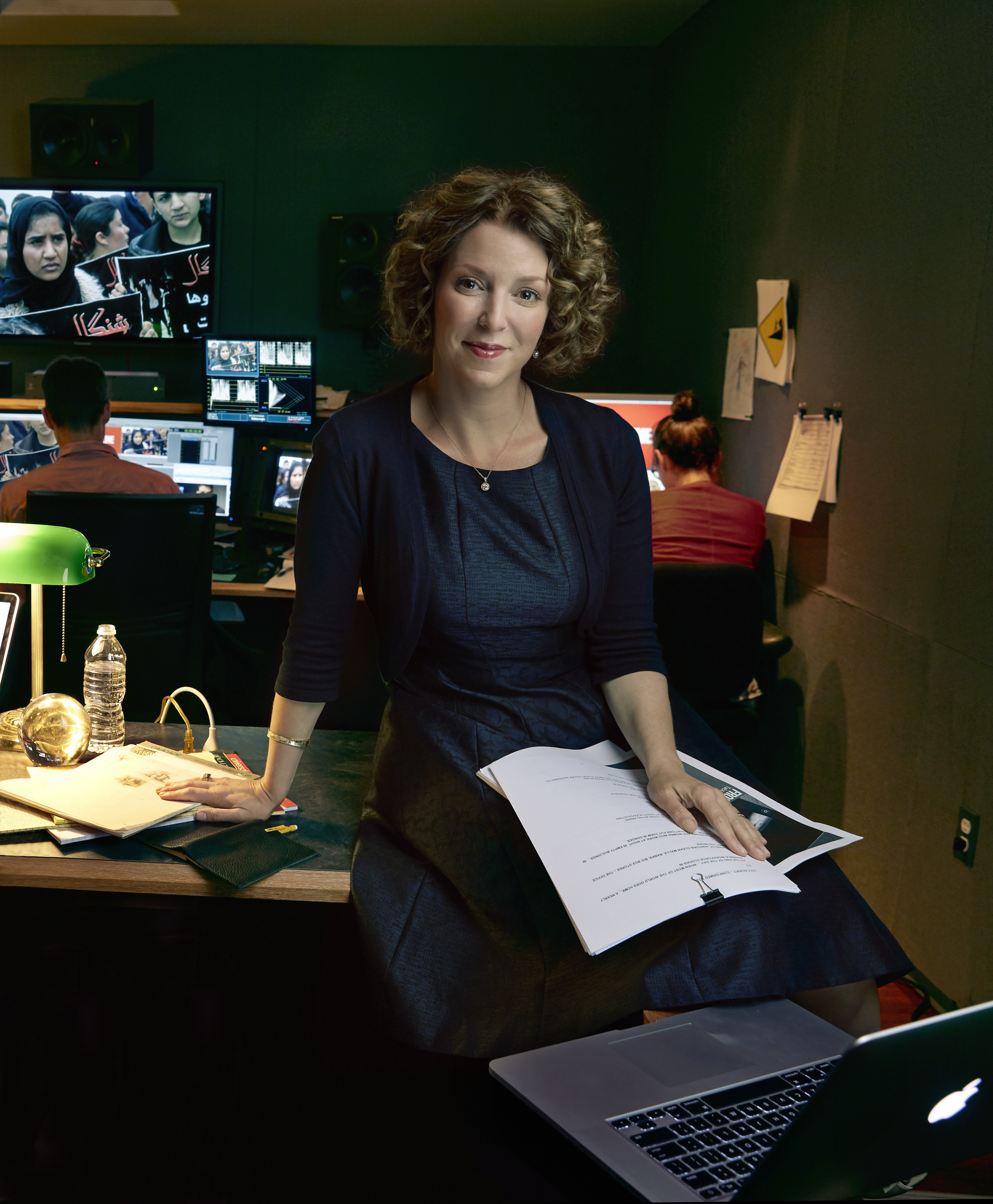
Raney Aronson
@raneyaronson
Talk: Friday, November 18 at 5pm
Join the Brown Institute in welcoming Raney Aronson-Rath, Executive Producer at FRONTLINE, PBS to talk about virtual reality, and its role in how we tell stories. With the recent explosion of VR – specifically 360-degree video– journalistic outlets are hungry for quality documentary content for immersive platforms. While immersive media experiences have become increasingly prevalent in the gaming and entertainment industry, we are only beginning to explore them within the context of documentary photography and journalism. How can media makers use immersion as a tool to build empathy, engage communities, and forward social change? How does immersing your viewer in content change the nature of the story you are telling? And how does this mode of experiencing a story change how journalists approach the planning, creation, and distribution of stories?
Raney Aronson-Rath leads FRONTLINE, PBS’ flagship investigative journalism series. She has been internationally recognized for her work to expand FRONTLINE’s reporting capacity, reimagine the documentary form across multiple platforms, and report and tell stories that matter in new, creative ways. Under Aronson-Rath’s leadership, FRONTLINE has won every major award in broadcast journalism, earned new funding to expand its investigative capacity and dramatically expanded its digital footprint. Under Aronson-Rath, FRONTLINE has produced several groundbreaking documentaries in VR — “Return to Chernobyl,” “On the Brink of Famine,” and “Ebola Outbreak” — and they will expand their exploration of virtual reality in journalism with a large grant from the John S. and James L. Knight Foundation. Prior to FRONTLINE, Aronson-Rath worked at ABC News, The Wall Street Journal, and MSNBC. She earned her bachelor’s degree in South Asian studies and history from the University of Wisconsin, and received her master’s from the Columbia University Graduate School of Journalism.
Workshop: Saturday, November 19 from 10am-5pm
with Marcelle Hopkins, New York Times & Matt MacVey, CUNY
The Virtual Reality workshop will take students who have little to no background in virtual reality and teach them the fundamentals of working in the medium. Journalists seeking to expand their storytelling beyond the still image and written word are encouraged to join. Selected participants will gain critical insights into emerging digital strategies in order to engage audiences across new immersive platforms.
The lab will commence with a discussion around exemplary case studies, and will then challeng participants to develop their own immersive story projects. Mixing theory with practice, participants will walk away from this lab with a concrete grasp of how they might integrate immersive storytelling into their practice and what that means for their subjects, audience, and impact.
Matt MacVey is developing immersive journalism curriculum and workshops at the CUNY Graduate School of Journalism. Matt wrote a report about immersive media for the NYC Media Lab and worked on interactive stories in the exhibitions department at the American Museum of Natural History.
Marcelle Hopkins is the Executive Producer for 360 News at The New York Times. Before joining The Times, she produced and directed virtual reality documentaries for FRONTLINE and Emblematic Group. In the past two years, she has received a reporting fellowship from the International Women's Media Foundation, a Magic Grant from the Brown Institute for Media Innovation, a Ford Foundation JustFilms fellowship at the Made in NY Media Center by IFP, and a United Nations Correspondents Association award. She spent seven years at Al Jazeera's UN bureau, where she produced TV news packages, interviews, features and documentaries.
 Series 4
Illustration
Talk: December 2 at 5pm
Workshop: December 3 from 10am-5pm
Panel: Friday, December 2 at 5pm
Word and image work together to produce beautifully told stories. Metaphor, humor and empathy are powerful visual tools to further engage a reader. Join us in the Brown Institute for a Friday night panel discussion with Andrew Horton, Alissa Levin, and Victor Juhasz on illustration as it relates to journalism. The panel will be moderated by Ellen Weinstein, who will conduct the Illustration workshop on Saturday.
Andrew Horton is the Creative Director of the Village Voice, Andrew Horton has previously led the art departments of Business Week, Billboard and Advertising Age. He has worked for magazines such as New York, Newsweek, Rolling Stone and Salt-Water Sportsman, and can consume his bodyweight in Vegemite.
Alissa Levin is founder and principal of Point Five, a New York City-based design studio specializing in work with an educational or cultural focus. Her work has been recognized by American Illustration, American Society of Magazine Editors, Society of Illustrators, Society of Publication Designers, and the Webbys. Born in Cleveland, Ohio, Alissa is a graduate of the Rhode Island School of Design.
Since 1974 (graduate of Parsons ’75) award winning Victor Juhasz has illustrated for many of the major magazines, newspapers, book publishers, advertising agencies, both national and international. For the past decade he has divided his time between humorous illustration and realistic visual documentation- witness art. He is a frequent contributor of satirical images to the National Affairs section of Rolling Stone Magazine. His representational work is part of the permanent collection of the US Air Force and, soon, the US Marine Corps. In August, 2011, he embedded with the 1-52nd Arctic Thunder Dustoff (helicopter medical evacuation) in Kandahar, Afghanistan. His artwork and writing appeared in GQ online in July 2012. He has covered the training exercises of USAF Combat Control and Pararescue teams as well as the Marines, most recently on the USS Bataan Navy/Marine Corps joint training exercises.
Workshop: Saturday, December 3 from 10am-5pm
with Ellen Weinstein
Journalistic outlets like The Wall Street Journal, The New York Times, The Atlantic and Nautilus use illustration as an important part of its content. A strong visual will draw a reader to a story. In this day long workshop, Ellen Weinstein, world-renowned illustrator and frequent contributor to many publications, will introduce basic visual thinking skills that will lead you through visualizing a story from text. How do you employ visual metaphors without being cliché? How do you create visual empathy with a subject? When is humor appropriate? During the day, we will create, discuss and think about word and image, not as separate entities but as halves of a whole.
Ellen Weinstein was born and raised in New York City. She is a graduate of Pratt Institute and New York’s High School of Art and Design. Awards include American Illustration, Society of Illustrators, Communication Arts Illustration Annual, Print’s Regional Design Annual, Society of Publication Designers, Society of News Designers and the Art Directors Club. She has judged numerous illustration competitions including Communication Arts Illustration Annual 2016, 2016 National Scholastic Art and Writing Awards, AOI/World Illustration Awards, Society of Illustrators Annual exhibition, Society of Illustrators Student Scholarship and Society of Illustrators Zankel Scholarship. She’s featured in an eight-page article in the March/April 2013 issue of Communication Arts. Ellen’s work is also featured in Illustration Now 5! by Taschen.
Ellen exhibits her work in local New York galleries as well as galleries in the US and Italy. She lectures and conducts workshops in various art schools and internationally including Ilustratour in Madrid, Spain, Fig.o5 Congreso Internacional de Ilustracion in Bogota, Colombia, MFAStudy in Beijing, China, MiMaster Ilustrazione in Milan, Italy, CEDRA Education in Moscow, Russia, Associazione Culturale Teatrio in Venice, Italy, Amarillo Design Space in Xalapa, Mexico and at ICON6 The Illustration Conference. She is an instructor at the Rhode Island School of Design and a guest lecturer at The Brown Institute for Media Innovation at Columbia Journalism School in New York City.
Ellen was the President of ICON8 The Illustration Conference that was held July 9-12, 2014 in Portland Oregon. She also served as the Programming Chair for ICON7. Ellen is on the Board of Directors of the Society of Illustrators and serves as Chairperson of the Museum Committee. Website: ellenweinstein.com
 Series 5
Networks
Talk: Friday, January 27 from 5pm-7pm
Workshop: Saturday, January 28 from 10am-5pm
Saturday workshop registration has now ended.
Friday talk is open to all.
In this installment, we will consider data that describe networks of people and organizations (often called “graphs"). These are structures that don’t fit easily into a spreadsheet — they encode relationships. Who knows who? Who worked for the same company? Who donated to or lobbied for which campaign? Who retweets who? These kinds of data let us connect the dots between people and organizations. Where are conflicts of interest? Can we track money or influence? On social media, can we see important “influencers” or visualize groups of people who share specific kinds of content?
Seminar: Friday, January 27 from 5pm-7pm
The world is a complicated place, and sometimes it's not the things themselves that's the story, but the connections between the things. two speakers whose projects transform these connections between things into first-rate journalism. The first is Kevin Connor, the director of the Public Accountability Initiative (PAI) and co-founder of LittleSis.org (think the opposite of Big Brother), an online wiki database tracking information on powerful people and organizations. Then we will hear from Mar Cabra, head of the International Consortium of Investigative Journalists (ICIJ) Data & Research Unit. She led a global team from ICIJ analyzing the 11.5 million documents in the famed Panama Papers leak.
Kevin Connor is the director of the Public Accountability Initiative (PAI), a watchdog research organization focused on corporate and government accountability. PAI conducts "power research," investigative research that brings transparency to how power relationships shape policy in the United States. PAI's research has consistently challenged the role of big money and corporate power in our democracy, garnering major media attention and prompting significant accountability measures and reforms. PAI takes a data-driven, movement-oriented approach to its work, and develops and maintains LittleSis.org (the opposite of Big Brother), an online wiki database tracking information on powerful people and organizations. Kevin co-founded PAI and LittleSis.org in 2008. Prior to that, he worked as a strategic researcher at SEIU and as a freelance corporate accountability researcher. His freelance projects included an early analysis of Wall Street banks’ role in causing the financial crisis.
Mar Cabra is the head of the International Consortium of Investigative Journalists Data & Research Unit, which produces the organization's key data work and also develops tools for better collaborative investigative journalism. She has been an ICIJ staff member since 2011, and is also a member of the network.
Mar fell in love with data while being a Fulbright scholar and fellow at the Stabile Center for Investigative Journalism at Columbia University in 2009/2010. Since then, she's promoted data journalism in her native Spain, co-creating the first ever masters degree on investigative reporting, data journalism and visualization and the national data journalism conference.
She previously worked in television (BBC, CCN+ and laSexta Noticias) and her work has been featured in the International Herald Tribune, The Huffington Post, PBS, El País, El Mundo or El Confidencial, among others. In 2012 she received the Spanish Larra Award to the country's most promising journalist under 30.
Workshop: Saturday, January 28 2017 from 10:00 – 5:00pm
with Lars Nordwall, William Lyon, & Jesús Barrasa of Neo4j
When analyzing datasets, journalists often find that complexity in the data force them to move beyond Excel and use a database to model and query their data. Usually the first step is using a relational (or SQL) database, but this approach often breaks down when trying to answer questions such as "Who is connected to whom?". While a relational database can be a good choice for some datasets, connected data (such as company registries, investor information, and communication networks) is difficult and cumbersome to work with in the relational model. Data journalists today turn to new tools to gain deeper insight. Have you ever struggled with trying to make sense of a spreadsheet with a dozen tabs? If so, then a graph database might be the tool you need to keep track of connections in your data.
This hands-on workshop will teach participants how to use a graph database to analyze highly connected data by applying network analysis techniques. We will focus on Neo4j, a database that was used to find stories in the Panama Papers leak and to facilitate the Swiss Leak investigation. We will show you how to explore a public dataset using Cypher, the Neo4j query language, to draw insights from the data. First answering questions, such as "Who is connected to whom?", "Who are the major influencers in the network", and "Who are the enablers in the network?" Building up our knowledge of Cypher as we progress, we'll show how you can use principles from social network analysis to find connections and discover potential stories. You'll learn how to visualize results using the Neo4j browser to quickly make sense of the data as we are exploring.
By the end of the workshop you will have an understanding of how to model and query data as a graph and how to apply network analysis techniques such as centrality and clustering to find potential hidden stories in public datasets.
Lars Nordwall, COO, Neo4j. Lars has a unique sense of being able to identify promising disruptive technologies at an early stage, with ability to transform it into world leading enterprises. His track record includes several start-ups that have reached multi-billion dollar exits. Lars has a M.Sc. Degree in Mechanical Engineering from the Royal Institute of Technology in Stockholm and TUM in Munich, and he has completed an Executive Education Program at Harvard Business School. Twitter: @lnordwall
William Lyon, Developer Relations Engineer, Neo4j. William Lyon is a Developer Relations Engineer with Neo4j. Prior to joining Neo, William worked as software developer for several startups in the real estate, quantitative finance and predictive API spaces. William holds a Masters degree in Computer Science from the University of Montana. Twitter: @lyonwj
Jesús Barrasa, Senior Graph Solutions Consultant, Neo4j. Jesús is a Senior Graph Solutions Consultant with Neo Technology based in London (UK). He combines over 15 years of professional experience in consulting and professional services in the Information management space. Prior to joining Neo Technology, Jesús got first hand experience with large Graph DB deployments in many successful projects for major telecommunications companies all over the world.
Jesús holds a Ph.D. in Computing Science from the Technical University of Madrid, where he carried out his research on graph data modeling and Semantic Technologies. Twitter: @BarrasaDV
 Series 6
Climate Change
Workshop: March 25 from 10am-5pm
Workshop: Saturday, March 25 from 10am-5pm
Lead Instructors:
Susanne Rust, Investigative Editor, Environmental Reporting, Columbia University
Gavin Schmidt, Director of GISS, NASA Goddard Institute for Space Sciences
Climate Science PhD students from Lamont-Doherty:
Weston Anderson, Ocean and Climate Physics
Alex Boghosian, Marine Geology and Geophysics
Logan Brenner, Biology and Paleo Environment
Kyle Frishkorn, Biology and Paleo Environment
Laura Haynes, Geochemistry
Nathan Lennsen, Geostatistics and Modern Climate
Ruth Oliver, Biology and Paleo Environment
Food production. Transportation. Energy usage. Critical infrastructure. Climate change is affecting almost every aspect of our lives. But reporting on climate is challenging, and many journalists feel uncomfortable engaging the topic outside an environmental beat. The subject can be technical, supported by data and models, some of which do not agree.
With this edition of the Transparency Series, we focus on climate change. For previous events, we presented techniques -- network analysis, poll interpretation, mapping. This time, our technique is "interdisciplinary collaboration" -- working with scientists to tell better stories. In a day-long workshop we will learn from leading climate scientists about how to cast climate as a character in stories, and not just the environment story. Sports? Real estate? Politics? Through collaboration, we can explore many more topics.
The morning will be spent with Gavin Schmidt, Director and leading scientist at NASA's Goddard Institute for Space Sciences, and Susanne Rust, Director of the Environmental Reporting Fellows at the Columbia Journalism School. In our time with them, we will survey the current landscape of reporting on climate change, and look to the tools, data and resources that exist for reporters trying to write about the topic. In the afternoon, students will be paired with PhD students in Columbia's Environmental Science program to come up with pitches of their own--new stories to contextualize the impacts of climate change.
 Series 7
Documents as Data
Workshop: April 8 from 10am-5pm
Workshop: Saturday, April 8 from 10am-5pm
Lead Instructors: R. Luke DuBois & Allison Parrish
Registration for this workshop is now closed. Thank you for your interest.
Artists Allison Parrish and R. Luke DuBois will introduce and discuss the ways in which textual materials (literature, poetry, news articles, government records and other primary sources, etc.) can be worked with as data in creative and insightful ways. Participants in this workshop will be exposed to some common techniques for textual analysis and representation of documents common in contemporary practice. Participants will be led through creative exercises around the intersection of computation and language as a way to gain familiarity and comfort with this medium. The workshop will involve a bit of programming in Python to allow participants to work with, visualize, and generate text in interesting ways.
 Series 8
Data Visualization
Seminar and Book Signing: May 5 at 5pm
Workshop: May 6 from 10am-5pm

Seminar and Book Signing with Manuel Lima: Friday, May 5 at 5pm
Join Manuel Lima for a fascinating tour through millennia of circular information design in architecture, urban planning, fine art, design, fashion, technology, religion, cartography, biology, astronomy and physics in a visual feast for infographics enthusiasts. From Venn diagrams and early celestial charts to the trefoil biohazard symbol and Target’s corporate logo, Lima provides a history of humanity's long-lasting obsession with all things circular and a unique taxonomy of the many varieties of circle diagrams.
In addition to the presentation, Lima will be selling and signing his latest work, 'Book of Circles'.Registration is not required to attend the event.
A Fellow of the Royal Society of Arts and nominated by Creativity magazine as “one of the 50 most creative and influential minds of 2009,” Manuel Lima is the founder of VisualComplexity.com, Design Lead at Google, and a regular teacher of data visualization at Parsons School of Design.
Manuel is a leading voice on information visualization and has spoken at numerous conferences, universities, and festivals around the world, including TED, Lift, OFFF, Eyeo, Ars Electronica, IxDA Interaction, Harvard, MIT, the Royal College of Art, NYU Tisch School of the Arts, ENSAD Paris, the University of Amsterdam, and MediaLab-Prado Madrid. He has also been featured in various magazines and newspapers, such as Wired, the New York Times, Science, Nature, Businessweek, Creative Review, Fast Company, Forbes, Grafik, SEED, étapes, and El País.


Workshop: Saturday, May 6 from 10am-5pm
Registration for the workshop has now closed
Lead Instructors: Mona Chalabi and Kenan Davis
Graphical (or pictorial) presentations of data have become an almost essential part of journalistic practice. Data visualization helps us see patterns in data, and is an important tool for finding stories. Also, outlets like The New York Times and The Guardian are publishing data visualizations that push the idea of story telling, creating new data-driven ways to inform and entertain. In this day-long workshop, Mona Chalabi will review some basic data visualization skills--guiding you through the design process. You will add annotation layers and learn to exploit what's unique about data. During the day, we will also help you think critically about visualizations, making you a better consumer of data graphics.
Mona Chalabi is a data journalist. She is the Data Editor of The Guardian US and a columnist at New York Magazine. As well as co-producing a four-part documentary series about vaginas, Mona has written for TV shows on National Geographic, the BBC and VICE. In 2016, Mona’s data sketches were commended by the Royal Statistical Society. The drawings, which are designed to make numbers more relatable, can be viewed on her Instagram account. Before getting into journalism, Mona worked in the nonprofit sector, first at the Bank of England, then Transparency International and the International Organization for Migration.
Kenan Davis is an associate editor at the New York Times. Previously, he was the interactive editor at The Guardian US and the coordinator of the Digital Media program at the Columbia Journalism School, where he also taught multimedia storytelling and web design.
